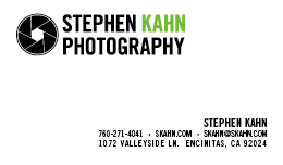
The client requested a new logo for his website.
His only requirement was that the logo needed to be more of a refresh of his current logo, keeping certain elements (the icon, for one). I re-styled the icon to one with fewer blades, as the original version seemed a bit busy. I then went with a more industrial looking font as this photographer shoots a lot of cars. The black with green accent color combination work very well with the graphical elements to bring a lighter side to the ‘seriousness’ of the design (e.g. balance).
